What is the Lorenz Curve
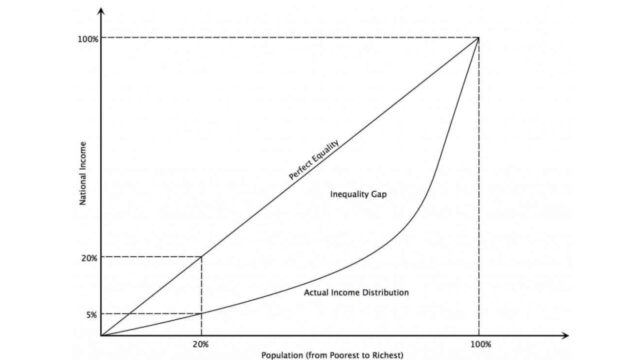
The Lorenz curve is a graphical representation of the distribution of wealth or income. It was developed by American economist Henry George Lorenz in 1905. The curve is constructed by plotting cumulative percentages of population against cumulative percentages of income or wealth. The resulting curve is always concave from below, meaning that it will bend inward as it goes from left to right.
The degree to which the curve bends inward indicates the level of inequality in the distribution of wealth or income. A perfectly equal distribution would result in a straight line, while a highly unequal distribution would result in a very tight curve. The closer the Lorenz curve is to the straight line, the more equal the distribution. In general, wealthier countries will have flatter (less curved) Lorenz curves than poorer countries.
How to calculate the Lorenz Curve
The Lorenz curve is a graphical way to visualize income inequality. To calculate the Lorenz curve, first gather data on the distribution of income in a population. Then, plot the cumulative percentage of people against the cumulative percentage of income they earn. The resulting curve will show how evenly or unevenly distributed the income is in the population. For example, if the Lorenz curve is close to a straight line, it indicates that the income is evenly distributed. If the curve is very flat, it indicates that a small number of people are earning most of the income. The Lorenz curve can be used to compare different populations or to track changes in income inequality over time.
Uses and applications of the Lorenz Curve
The curve is created by plotting the cumulative percentage of population against the cumulative percentage of wealth. The resulting shape can then be used to calculate the Gini coefficient, which is a measure of inequality. The Lorenz curve has a number of uses and applications, both in economics and in other fields. For example, it can be used to measure inequality in income, wealth, or consumption. It can also be used to compare different countries or regions, or to track changes in inequality over time. Additionally, the Lorenz curve can be used in conjunction with other statistical tools, such as regression analysis, to help explain why inequality exists and how it can be reduced.
Limitations of the Lorenz Curve
The Lorenz curve has several limitations. First, it only consider household income, and does not take into account other important factors such as wealth or access to resources. Second, the Lorenz curve does not reflect the distribution of resources within households. For example, two households may have the same total income, but one household may have all its income going to the head of the household while the other household may have a more even distribution of income among its members. Third, the Lorenz curve only measures inequality at a single point in time, and cannot be used to compare inequality across different time periods or geographical areas. Despite these limitations, the Lorenz curve remains a valuable tool for measuring income inequality.
Comparison of different Lorenz Curves
There are many different ways to measure inequality, and the Lorenz curve is one of the most popular methods. The Lorenz curve is a graphical representation of the distribution of wealth or income, with the x-axis representing the population and the y-axis representing the percentage of wealth or income. The curve itself shows how evenly distributed the wealth or income is within a population. There are several different types of Lorenz curves, each with its own advantages and disadvantages.
The most common type of Lorenz curve is the household curve, which measures inequality within a household. This type of curve is easy to calculate and understand, but it does not give a true picture of inequality because it does not take into account different household sizes. The Gini index is another common type of Lorenz curve, and it is often used to measure inequality between countries. The Gini index is more complex than the household curve, but it gives a more accurate representation of inequality.
Finally, the concentration index is a type of Lorenz curve that measures inequality within a population. The concentration index is more difficult to calculate than the other two types of curves, but it provides a more accurate measure of inequality.
Other measures of inequality
The curve is created by plotting the cumulative percentage of wealth against the cumulative percentage of the population. The resulting curve will always fall below the line of equality, where everyone has an equal share of wealth. The further away from the line of equality, the greater the level of inequality. The Gini coefficient is a mathematical formula that can be used to measure the amount of inequality in a population.
It is calculated by dividing the area between the Lorenz curve and the line of equality by the total area under the curve. A Gini coefficient of 0 indicates perfect equality, while a Gini coefficient of 1 indicates perfect inequality. There are many other measures of inequality, such as the Palma ratio and the Atkinson index. However, the Lorenz curve and Gini coefficient are by far the most commonly used measures.


